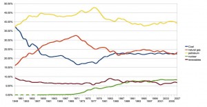
(Source: EAI)
Renewables clock in at about 7% only. Given the massive energy requirements of the US, it will be quite a ways before this can be covered by wind, solar, etc. But you can also see the incredible amount of carbon-producing sources we are burning through.
Now compare this to the world energy consumption per capita. There is a strong relationship between wealth and energy consumption:

So how much would a change in US energy policy matter? Well, the 5% of the world's population that lives in the U.S. has more environmental impact than the 51% that live in the other five largest countries. Quite an extraordinary leverage (an imbalance)...

No comments:
Post a Comment